A full website is more than most coaches need.
But a linktree isn't enough.
You build trust through your content. But when someone clicks the link in your bio, they land on a linktree. A page designed for a phone screen, because that's all it was ever built for. A few buttons, no story, nothing that shows what you actually do or why you can help.
The other option is worse. A full website has more pages than anyone will click through, when all a prospect really wants is the highlights, with the option to go deeper if they're interested. None of it has video, even though that's the best way to gain trust with your leads.
The gap nobody was filling
Building a full website for my coaching business didn't fix the problem I actually had. It just wasn't simple enough to get the point across fast. I'm still glad I built it. I just needed something more compact to go with it.
I knew a linktree wasn't the answer either. It's fine for what it is, but it doesn't let anyone go deeper, and a stack of buttons doesn't look like much on a desktop screen. Not a great look for a coach or consultant trying to be taken seriously.
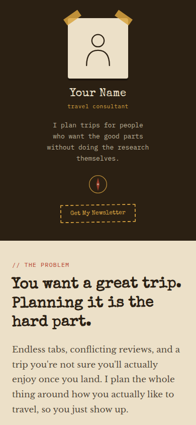
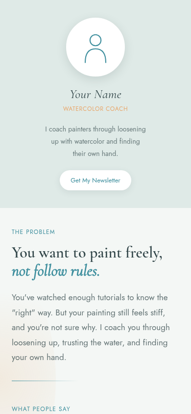
Something that reads like a letter: top to bottom, like an actual conversation, not one of those landing pages that scrolls forever and never gets to the point. One page that tells the full story, works on mobile and desktop, and doesn't require a web agency or a platform subscription to keep it alive. That page has a structure, and it's the same one every time.
Problem → Proof → Promise → Plan
Every Shelly Site follows the same four-part order, not because it's a formula, but because it's the order that actually moves people from curious to invested.
Sample Shelly Sites
Two examples built with the same structure, different brands, different coaches, same result.
What's Included
This isn't a plug-and-play template. The structure stays the same, but everything inside it (your words, your colors, your offers) is built around you. You give me the information, I build it. Once it's yours, it's yours to keep, no ongoing fee to me, and you can update it anytime just by talking to Claude.
- 4 pages total: 1 home page + 3 offer pages
- Home page, 7 sections: sidebar bio, header, reviews, services, plan, newsletter signup, footer
- 3 offer pages, 5–7 sections each, linked from the home page
- 1 external link block (e.g. your community)
- Submit your content through a simple form: text, images, and links for each section
- Fully customized to your brand colors
- Full handoff with instructions to host it yourself. No monthly platform fees, no lock-in.
- Support if you have questions along the way
- Extra animations included
- Turnaround: 7–10 days after we receive all your site info
- Everything listed above
- You handle your own Hostinger setup
- Drop in your files at handoff
- Everything in Basic
- Domain name transfer
- Full initial website setup on Hostinger, done for you
- GitHub setup support (optional)
Your site runs on Hostinger — you'll need an account to go live. Instructions are included, and it takes about 5 minutes. Get 20% off Hostinger →
How It Works
Choose Basic or Premium, whichever fits where you are right now.
Fill out the form with your content, images, and links. That's it.
7–10 days once everything's in. You'll hear from me if I have questions.
Basic: create your Hostinger account and drop in your files. Premium: it's already set up for you, domain and all.
Yours to keep. No ongoing fees to me. And if you ever want updates handled for you — new offers, fresh copy, anything that changes — ongoing support is available. Reach out to discuss →